Important Event Website Trends.This guide sums up the most important trends in website design, and how they apply to your event website. Although you may think event websites are different to other sites, in fact, they have exactly the same goals. Have a look at 14 examples below and how to get webdesign to work to your advantage!
1. Design is about solving problems
We’re not saying websites shouldn’t look good, but the main idea behind any website is to serve a function, to solve a problem. An event website has two main problems to solve:
- Provide important and attractive information regarding the event,
that will…
2. Get more people registering for the event.
In 2016, event websites will be focusing more on solving these two problems, than trusting in attractiveness alone. The designs of event websites will feature more clearly outlined event schedules, easy to spot “Register” triggers and comprehensive pricing options.
Key takeaway: Design follows function, and not the other way around.
2. Bye bye, hamburger menu In 2015, 80% of Internet users owned a smartphone, and in the UK, the smartphone was already the most popular device for browsing online. Hamburger menus don’t work on mobile devices because they are difficult to spot and difficult to reach when positioned on the top left corner of the screen, while the mobile device is being held with the right hand.
As we said in the beginning, design is about solving problems, not creating them. A research cited by Tech Crunch shows that A/B testing and interaction theory give preference to a top bar menu, instead of a hamburger menu, and online giants like Apple, Google and Microsoft have already moved away from this type of layout.
If you have a number of pages with vital information about your event, don’t cram them all under a hard to find Hamburger menu, use a top or sidebar menu instead.
Key takeaway: Apple, Google and Microsoft have moved away from the Hamburger menu, and so should you.
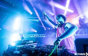
3. Highly Vibrant color schemes and neon palettes
With the evolution of screen technology and even smartphones now supporting high-definition screens, it’s time to go bold or go home. Use vibrant color schemes and neon palettes on your event website.
“We are going to see bright color palettes of Caribbean blues, raspberry, aquamarine, coral, citrus, peach, parakeet, cobalt and tangerine,” Danielle Couick, Magnolia Bluebird Design and Events for Special Events Magazine.
And if you think bright, neon colours aren’t good enough for serious topics and formal events, have a look at the Bloomberg Politics webpage, and reconsider.
Key takeaway: We said design should follow function, but that doesn’t mean your event website shouldn’t follow important design trends.
4. Gradients
In combination with the brighter color palettes being used in website design today, there is also a trend for grouping flowing gradients of color.
Key takeaway: Gradients are attractive and already gaining momentum for event website design in 2016.
5. Social Proof
According to research by AMEX Meetings and Events, 85% of 420 respondents believe that in 2016 there will either be stability or a rise in the number of business meetings and events. At the same time, British Visits and Events Partnership (BVEP) believe Britain will also benefit from a 8.2% rise in the events industry there.
This is all good news, but more events mean bigger competition for attendance numbers. One clear way of standing out from the crowd is through social proof. There are 5 Types of Social Proof, and this is how they relate to your events:
- Expert – famous or trending industry speakers in the schedule
- Celebrity – celebrities attending the event, or part of the schedule; may also be a big corporate sponsor
- User – testimonials from attendees
- Wisdom of the crowds – previously high or currently big attendee numbers
- Wisdom of your friends – referrals from attendees
To stand out from competing events, add one or more of these 5 social proofs to your event website. Your website should feature positive testimonials and feedback from previous attendees. A showcase of the performers or speakers, may also include interviews. And, of course, images of the sponsors and partners behind the event. Show the website visitor your event is ‘serious business’.
Key takeaway: Use social proof elements in your event website, you can also use them in your email marketing, social media marketing, blog, even in your email signature!
6. Form Fields
Research from as far back as 2011 has shown that fewer forms (or boxes to fill-in) increase registrations and sign-ups. However, consequent research moved the topic from quantity to quality, but what does that actually mean?
The new research has shown that website visitors are quite adept at recognizing what information in a form is actually necessary, and what is just greedy database building. If you are organizing a business seminar for example, you probably wouldn’t need the participants’ home addresses, but you will need the names of the companies they work for.
The ideal length of the registration form will continue to depend on the type of event being hosted.
Key takeaway: Remove all non-essential fields from the registration form and only leave the information you actually need from the attendees.
7. Networking and Attractions
People attend live events for a number of reasons, in general, these can be grouped in 3 broad categories:
- Education
- Networking
- Experience
We already mentioned the predicted rise in competing events, but there is also an evolution of the online knowledge base reducing event attendance in two additional ways:
- Education is available online in the form of eBooks, podcasts and tutorials, all available at the click of a button, a lot of the time for free.
- Networking is also available online via email and in the form of informal and professional social networks such as LinkedIn, Xing and Facebook.
The only feature of live events not available online, is the live experience. To distinguish your event from the competition, demonstrate uniqueness, grow your attendance numbers, you need to place more emphasis on the experience.
The event website is THE place to show off your outstanding event design, distinctive activities and unique sessions. Show off your greatness in a way that shouts “Are you not entertained?”, Russell Crowe style.
Key takeaway: Emphasize on the uniqueness of the experience your event offers on your event website.
8. Conversion triggers
Conversion triggers are design elements, statements, buttons and any and all website elements that focus on alluring website visitors to sign-up, register and make a purchase. These are important because online visitors nowadays are ever more savvy and prone to ADD.
Conversion triggers on your event website need to clearly display and communicate the following:
- Event pricing plans
- Special offers and discounts
- Dates and limits of all pricing options and deals
- Benefits of attending
- Social proof examples
Make sure the information is easily identifiable, easy to understand and persuasive in design.
Key takeaway: Use conversion triggers on your event website to entice visitors to register a.s.a.p.
9. Long scroll
In the past website designers detested lengthy pages with long scrolling, however with the evolution of landing pages and single webpage designs and templates, long scrolls are now trending. There are also these two important trends pushing the long scroll:
- Social media: Facebook, Twitter, Instagram, LinkedIn, Pinterest, virtually all social media websites and apps feature endless scrolling.
- Smartphones and tablets: Browsing on a smaller size screen automatically leads to more scrolling.
Instead of creating complex menus and website architectures, put everything under one roof, but remember to create a captivating and engaging design.
Key takeaway: Don’t fear the single webpage design and get used to the long scroll because it is a trend that’s here to stay.
10. Background animations and videos
Videos and animation will forever be more captivating, than pictures and text alone. A number of event websites now feature a background video from the last edition of the event in various forms.
You can use footage on your event website to showcase:
- Positive feedback in the form of interviews with attendees
- Inspiring interviews with speakers or performing acts
- Unique performances and sessions from previous events
- Exciting highlight reel from a previous event
Video is a great way to showcase the experience from the event and also provides engaging social proof right on your event’s front page, the event’s website.
Key takeaway: Embed video on your event website to showcase your event(s), if you don’t have any footage start collecting a.s.a.p.!
11. Responsive Desig
This year brought Google’s Mobilegeddon, a search engine algorithm update, which now places websites which don’t have a responsive design (are not mobile-friendly) lower in Google’s search results.
“Despite being the second-largest airline in Europe, Ryanair, the no-frills carrier based out of Ireland, doesn’t show up until about a third of the way through the second page of a search for “budget airlines.” According to the Mobile-Friendly Test, the airline’s mobile viewpoint is not set, in addition to too-small text and too-close links.” – Source
Make sure your event website is responsive, or in other words, functions on all types of devices just as well as it does on a desktop or laptop. Mobilegeddon aside, with tablet and smartphone browsing on the increase, it’s extremely annoying to visit a website which appears non-functioning or, even worse, malfunctional on a mobile device.
Key takeaway: Make your event website mobile-friendly.
12. Simple typography
As we said earlier, online visitors nowadays are marketing savvy, immune to sales tricks and prone to ADD. That means you need to be direct and to the point with your event website presentation and message.
Keep a clear and easy to read typography on your event website and make sure it follows accordingly throughout. At the end of the day, you want the visitor to easily identify the value of your event and to register, fullstop.
Key takeaway: Use a simple, easy to read typography and focus on your message, rather than the design alone.
13. Blurred images

Don’t have a video for your website? Don’t worry! You can used a blurred image to a similar effect.
Blurred images are great at suggesting action, mystery, surprise, a buildup of excitement:
- “A blurred background can bring focus to layers on top of the image such as text. Just make sure to select an impactful typeface.
- It can create new interest with an image that you use regularly, such as a standard brand photo.
- It can be used with almost any type of content in almost any color scheme for universal appeal.”
Source: Design Shack
If you want to use a blurred image on your event website, distort an image of high quality, don’t just use a bad quality image that is blurred by default, there is certain technique to it.
Key takeaway: If you don’t have a video, use a blurred image on your event website’s landing page with a clear typeface on top!
14. Passive-aggressive pop-ups

Exit intent pop-ups are the messages that appear on your screen as you attempt to leave a website. They are usually triggered when the mouse suddenly accelerates in any direction, meaning that the visitor is likely to leave.
The pop-ups are a great chance to retain the visitor, maybe even into triggering him to make a purchase. For an event website an exit intent pop-up can be used to:
72 % of U.S. adults say they prefer companies to communicate with them via email, and 91% say they’d like to receive promotional emails from companies they do business with. Meanwhile, 73% of companies agree email marketing is a core part of their business efforts. And 25% rate email as their top channel in terms of return on investment.
Source: Entrepreneur